The selectItems Tag
The selectItems Tag
The selectItem tag represents a UISelectItem component. The selectItems tag represents a
UISelectItems
component. You can use either a set of selectItem tags or a single
selectItems
tag within your selectOne or selectMany tag.
The advantages of using the selectItems tag are as follows:
You can represent the items using different data structures, including Array, Map and
Collection
. The data structure is composed of SelectItem instances or SelectItemGroup
instances.
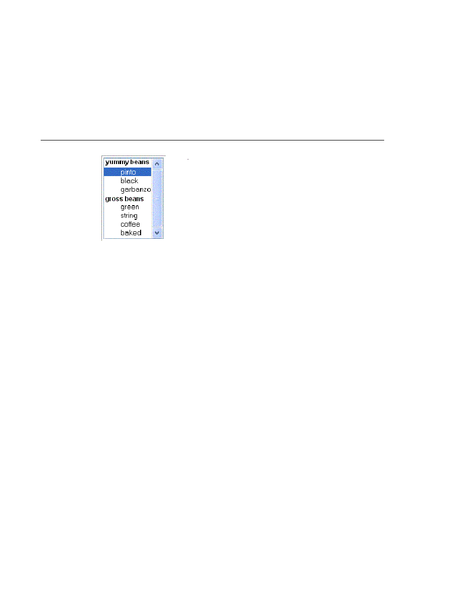
You can concatenate different lists together into a single UISelectMany or UISelectOne
component and group the lists within the component, as shown in
You can dynamically generate values at runtime.
The advantages of using selectItem are as follows:
The page author can define the items in the list from the page.
You have less code to write in the bean for the selectItem properties.
For more information on writing component properties for the UISelectItems components,
see
. The rest of this section shows you how to use the
selectItems
and selectItem tags.
Using the selectItems Tag
Here is the selectManyCheckbox tag from the section
<h:selectManyCheckbox
id=
"newsletters"
layout=
"pageDirection"
value=
"#{cashier.newsletters}">
<f:selectItems
value=
"#{newsletters}"/>
</h:selectManyCheckbox>
FIGURE 116
An Example List Box Created Using SelectItemGroup Instances
Adding UI Components to a Page Using the HTML Component Tags
Chapter 11 · Using JavaServer Faces Technology in JSP Pages
347