Rendering Components for Selecting OneValue
Rendering Components for Selecting OneValue
panelGroup
tag. This is because styles such as those that set width and height are not applied to
inline elements, which is how content enclosed by the span element is defined.
A panelGroup tag can also be used to encapsulate a nested tree of components so that the tree of
components appears as a single component to the parent component.
The data represented by the nested component tags is grouped into rows according to the value
of the columns attribute of the panelGrid tag. The columns attribute in the example is set to 3,
and therefore the table will have three columns. In which column each component is displayed
is determined by the order that the component is listed on the page modulo 3. So if a
component is the fifth one in the list of components, that component will be in the 5 modulo 3
column, or column 2.
Rendering Components for Selecting One Value
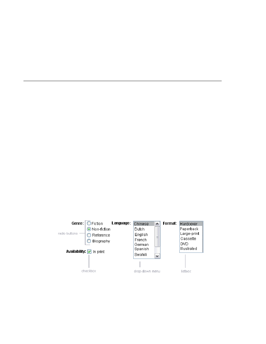
Another common UI component is one that allows a user to select one value, whether it be the
only value available or one of a set of choices. The most common examples of this kind of
component are:
A check box, which represents boolean state
A set of radio buttons
A drop-down menu, which displays a scrollable list
A list box, which displays an unscrollable list
shows examples of these components.
Displaying a Check Box Using the selectBooleanCheckbox Tag
The UISelectBoolean class defines components that have a boolean value. The
selectBooleanCheckbox
tag is the only tag that JavaServer Faces technology provides for
representing boolean state. The Duke's Bookstore application includes a
selectBooleanCheckbox
tag on the bookcashier.jsp page:
FIGURE 114
Example Select One Components
Adding UI Components to a Page Using the HTML Component Tags
Chapter 11 · Using JavaServer Faces Technology in JSP Pages
343